Neon Aesthetics: From TRON to Cyberpunk, From Radar to Signal Pitch
Why does neon green mean 'digital'? From the oscilloscope to TRON, Blade Runner to synthwave — the half-century biography of on-screen light.
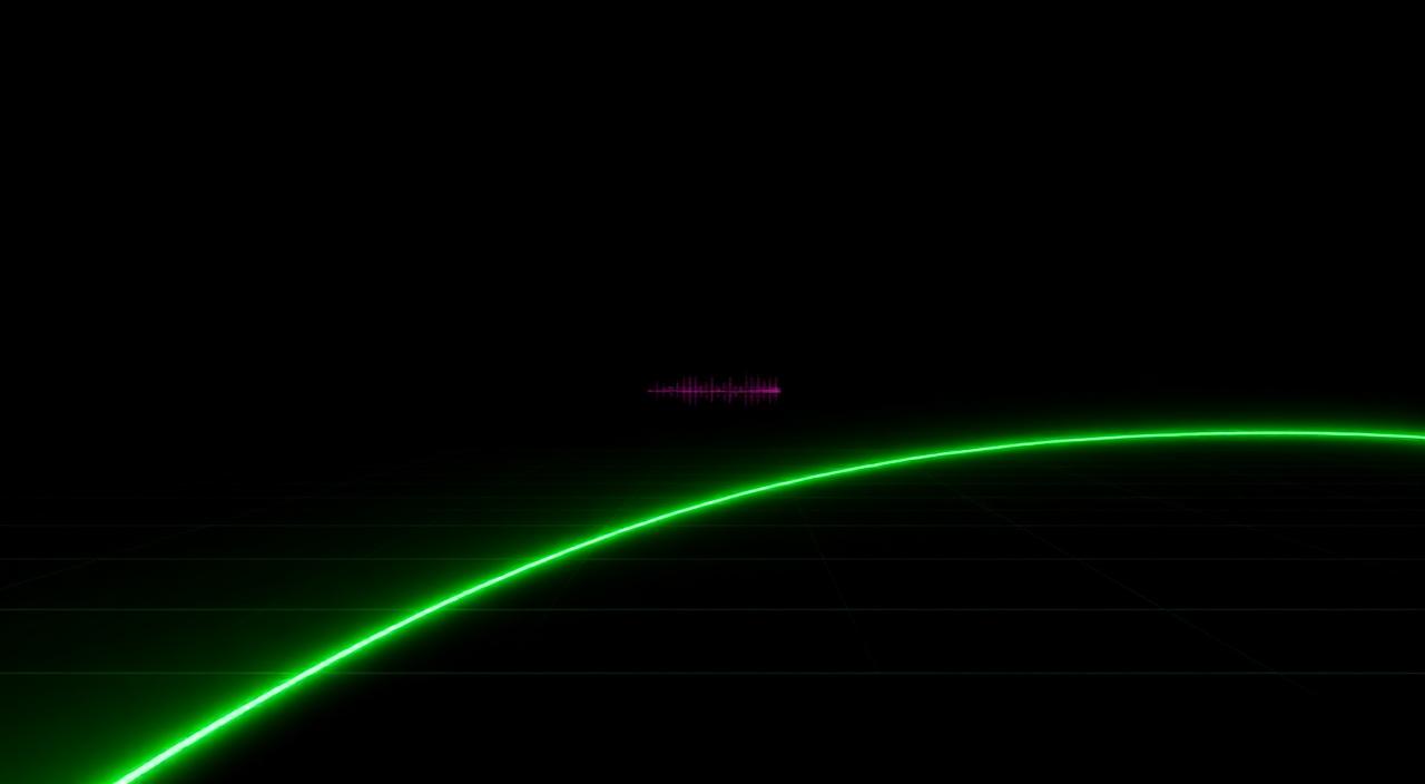
A black screen. A green line pulses across it, rising and falling like a heartbeat. You may not know exactly what it is, but your brain does: radar. computer. digital. That reflex isn't natural — it was taught. It was born in the 1940s, canonised in the 1980s, buried in the 1990s, revived in the 2010s, and now stands as an aesthetic in its own right.
This is the cultural biography of the green line on the screen — and more broadly, of neon light: how a visual language was born, how it became canon, and why Signal Pitch's palette choice is no accident.
Origin: phosphor, oscilloscope, radar (1930–1960)
In 1929 Vladimir Zworykin perfected the cathode-ray tube. Inside it, phosphor emitted light when struck by electrons. The cheapest, brightest, longest-lived phosphor was P1 — roughly 543 nm, a saturated green. Engineers chose it because the human eye is most sensitive to green. An economic decision became a cultural inheritance.
Throughout WWII, radar operators sat in front of black screens for hours, tracking aircraft as green dots. That generation lived the war through a green interface. When they got back to cinema, "military interface" meant "green screen."
In 1958 William Higinbotham built Tennis for Two on an oscilloscope at Brookhaven — one of the first video games in history. The ball and paddles glowed on green phosphor. The computer game was green because the screen was green, because the phosphor was cheap.
Hollywood canon: Alien, TRON, Blade Runner (1979–1982)
Three years. Three films. A whole visual language.
Alien (1979) — the company's green interface
Ridley Scott's Nostromo held a secret only one entity knew: the ship's AI, "Mother." Mother's screens were green-amber, characters huge and monospaced, blinking letter by letter. That wasn't dressing — it was a character. Hollywood learned the face of the computer that night.
TRON (1982) — neon takes physical form
Steven Lisberger's TRON was the first film to show digital space as concrete: light cycles, gridded floors, neon contours. Cyan, magenta, green. Visual consultant Syd Mead used neon not as decoration but as a topological tool — light lines drew edges, telling boundary instead of volume. After TRON, "digital space" meant "neon grid."
Blade Runner (1982) — neon goes underground
Scott shot Blade Runner the same year. This time neon wasn't on the screen but on the street: Chinese signs in the rain, Coca-Cola billboards, broken sign lights. Cyberpunk was born. Neon now meant not just "the computer of the future" but the city of the future: dystopian, crowded, leaking.
Two films, two neons. TRON's is clean, geometric, optimistic. Blade Runner's is dirty, chaotic, melancholic. For the next forty years screen designers would swing between these two poles.
The 1990s: the death of neon
Colour monitors got cheap, resolutions climbed, "photorealism" became the dream. In the 1990s neon meant "old." Interfaces went grey-blue (Mac OS Classic, Windows 95). Web 1.0 was black on white, grey boxes, blue underlined links. The green screen survived only in terminals — the world of "experts."
Then in 1999 The Matrix arrived. A single film revived neon as a nostalgic code: green Japanese-character rain, terminal green, screens inside screens inside screens. Its success reminded a generation thatthe green screen means "code," means "I can see and you cannot."
2010s: the synthwave revival
Around 2011, a wave of French electronic musicians — Kavinsky, Lazerhawk, College — built a subgenre modelled on 1980s Vangelis and John Carpenter soundtracks: synthwave. Its visual language was a TRON-Vapor-Miami Vice hybrid: magenta-pink gradients, perspective grids on the horizon, palm trees, neon type.
Then Hotline Miami (2012), Far Cry 3: Blood Dragon (2013), Drive (2011), Kung Fury (2015), Stranger Things (2016), Cyberpunk 2077 (2020). The 1980s flipped from nostalgia to canon.
Reading neon: not colour, meaning
When a designer picks "neon green" today, they don't pick a colour — they pick a package of meaning:
- Green: radar, terminal, "the watching machine." Silent vigilance.
- Cyan: data, information flow, "the teaching machine." TRON's life-line.
- Magenta/pink: creativity, vapor, "the remembering machine." Synthwave nostalgia.
- Red: danger, pressure, "the judging machine." The press line, the error alert.
- Amber: document, old terminal, "the keeping machine." Prime nostalgia colour.
Signal Pitch's palette choice
Three colours were chosen for Signal Pitch:
- Black background — because silence is the baseline, visual silence is the baseline too.
- Neon green (~#4ade80) — the signal line. Carrying the "radar, information, watching" inheritance.
- Red/warm (pressure lines) — threat. The exact opposite of green's meaning.
Three colours suffice because each carries a verb: green "I'm here," red "I'm closing on you," black "nothing yet." Adding colour would blur the verb. This is the visual side of minimalist design.
A player opening Signal Pitch for the first time doesn't ponder "what genre is this?" — the answer is already on screen. The black-green-red palette says "radar, pressure, watching" without a single word.
Closing: a colour's half-century biography
Neon green was born as cheap phosphor in the 1940s. It became canon in Hollywood in the 1980s. It was buried in the 1990s. It was resurrected in the 2010s. Every flicker you see on a screen today carries a trace of that long biography.
Signal Pitch knows that biography and adds another volume with respect: a signal ritual that joins the radar inheritance to minimalist discipline, using black as the colour of silence and green as the colour of watching. Drawing everything a single colour can say out to its last cell — this is the side of design you want to see.