Signal Visualisation: A Century from Oscilloscope to Data Art
How do we show a signal? From oscilloscope to PPI radar, from sound waves to modern data art — a hundred years of making the invisible visible.
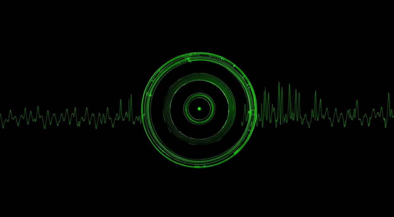
A signal is invisible. An electromagnetic wave, an acoustic wave, a network packet — all flow outside human senses. To understand them we must make them visible. Signal visualisation is therefore as much a design problem as an engineering one: compress time, frequency, amplitude and phase onto a two-dimensional surface.
This piece traces a hundred years of making invisible signals visible — from Ferdinand Braun's 1897 cathode-ray tube to today's WebGL data art.
1. 1897: Braun and the cathode-ray tube
German physicist Karl Ferdinand Braun deflected an electron beam with coils inside a glass tube and made it draw a dot on a phosphor screen. Sweeping the beam quickly produced a continuous line. This is the ancestor of the modern oscilloscope.
The oscilloscope rests on one principle: horizontal axis is time, vertical axis is amplitude. It turns a signal's evolution in time into something the eye can follow. That simple idea became the spine of 20th-century electronics.
2. 1940s: PPI and circular visualisation
World War II radar engineers had a problem: oscilloscopes show linear time, but radar rotates. The answer was the Plan Position Indicator (PPI) — a CRT in which the beam sweeps from centre outward like the antenna arm, painting returns at each angle.
Its key feature was the slow phosphor decay. A point would keep glowing for seconds after the beam passed. Hence radar's characteristic sweep aesthetic: a rotating line with a fading trail. A technological side-effect became, decades later, the symbol of sci-fi.
Once a technology finds the right visual language, the language outlives the technology. PPI's rotating arm no longer stands for radar so much as for the idea of radar.
3. 1965: the Fast Fourier Transform and the spectrogram
When Cooley and Tukey published the FFT in 1965 it became possible to move a signal from time to frequency at computer speed. The visual offspring is the spectrogram: time on X, frequency on Y, amplitude in colour.
The spectrogram is everywhere today — from speech recognition to music production, from biology labs to seismology. Modern voiceprinting was born from this visual language.
4. 1997: Winamp and lightweight data art
Signal visualisation's first mass-cultural moment was probably Winamp's visualiser plugins. Milkdrop turned the FFT of a playing track into organic forms on screen. Music wasn't only heard, it was watched.
That shift moved signal visualisation from engineering tool to cultural expression. Today's shader art and live VJ scene are direct descendants.
5. 2010s: D3.js and interactive data art
Mike Bostock's D3.js (2011) put data visualisation in every browser. The New York Times, FiveThirtyEight and The Guardian built modern data journalism on top of it.
D3 is a data-binding library: bind HTML/SVG elements to data and the DOM updates automatically. That paradigm later leaked into React, Vue and Svelte — making data viz part of mainstream web engineering.
6. WebGL, GPU shaders and real-time visualisation
WebGL and then WebGPU gave the browser direct GPU access. Millions of points per second, particle systems, full-screen shader simulations — all in real time.
For game designers a new door opened. What we used to call a “game scene” is now a signal painting. Ball, player, pass line, pressure wave — all signals drawn in the same frame. The line between a game engine and a data-art canvas almost disappeared.
7. Three golden rules of visualisation design
- One axis, one meaning: each dimension maps to a single variable.
- Colour is last resort: position first, then shape, then motion, then colour. Colour is the weakest channel.
- Decay is natural: old data doesn't vanish — it fades. From PPI phosphor to D3 transitions, the principle holds.
Conclusion: a signal offered to the eye
The central sentence hasn't changed in 120 years: make the invisible visible — without exhausting the viewer. A radar, a spectrogram, a Milkdrop plugin, a pressure wave in a game — they share a profession.
Signal Pitch's radar aesthetic owes a debt to this lineage. The field isn't a canvas but an intuitive continuation of a historical object — the PPI screen. Eighty years on the language keeps writing new sentences, and ours is one of them.